







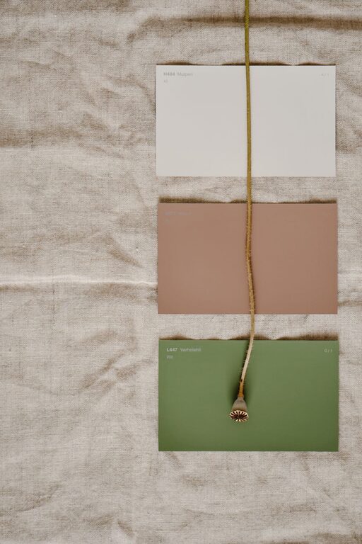
Creating a calm and serene environment in your home starts with choosing the right colors. Colors have a powerful effect on our mood and can influence how we feel in a space. If you want to make your home a relaxing retreat from the busyness of life, selecting calm colors is a great place to begin.
In this post, we’ll explore practical tips for choosing calming colors that suit your style, brighten your space, and enhance your well-being.
Why Choose Calm Colors?
Calm colors are typically soft, muted, and gentle on the eyes. They tend to evoke feelings of peace, relaxation, and balance. Using these colors in your home can:
– Reduce stress and anxiety
– Improve sleep quality
– Promote focus and mindfulness
– Make rooms feel more spacious and airy
Whether you want a cozy bedroom, a tranquil living room, or a soothing bathroom, calm colors help set the perfect mood.
Popular Calm Color Families
While personal preferences vary, some color families are commonly associated with calmness:
Blues
Blue is well-known for its calming effect. Light blues and soft grays with blue undertones resemble the sky and water, encouraging a sense of tranquility.
Greens
Green connects us with nature and symbolizes growth and harmony. Soft sage, mint, or olive shades create restful spaces and bring freshness indoors.
Neutrals
Neutral colors like beige, cream, soft taupe, and warm grays provide a gentle backdrop that feels clean and balanced without being dull.
Pastels
Light pastel colors such as lavender, blush pink, and pale yellow can add a soft, uplifting charm while keeping the atmosphere calm.
Tips for Choosing Calm Colors in Your Home
1. Consider the Room’s Purpose
Think about what you want from each space. Bedrooms benefit from deeper, restful shades like muted blues or greens. Living rooms and kitchens are great for warm neutrals or soft pastels that invite calm conversation and connection.
2. Test Colors at Different Times
Lighting greatly affects how colors appear. Test paint samples on your walls and observe them in natural daylight and evening lighting before making a final decision.
3. Use a Color Palette
Select a simple color palette consisting of two or three calm shades for your space. This helps create harmony and makes decorating easier.
4. Blend with Texture and Natural Elements
Colors work hand in hand with textures to create calmness. Incorporate natural materials like wood, linen, or cotton in neutral colors to add warmth and softness.
5. Avoid Overly Bright or Dark Shades
Bright, intense colors can be energizing but may disrupt a calm atmosphere if overused. Similarly, very dark colors can make a room feel closed in unless balanced with light accents.
6. Add White or Light Accents
Pair calm colors with crisp white or light accents to keep the space feeling fresh and open. White trim, light-colored furniture, or curtains can brighten the room.
7. Keep It Personal and Comfortable
While there are general guidelines, remember your preferences matter most. Choose shades that make you feel relaxed and happy in your home.
Examples of Calm Color Combinations
Here are a few popular combinations to inspire your next home project:
– Soft blue walls with white trim and natural wood floors
– Sage green paired with cream furniture and woven rattan accessories
– Light gray walls accented with pale lavender décor and silver accents
– Warm beige walls mixed with blush pink textiles and light oak furniture
Final Thoughts
Selecting calm colors for your home is a simple yet impactful way to promote peace and comfort. By considering the purpose of each room, testing colors in different lighting, and pairing hues thoughtfully, you can create a soothing environment that supports your well-being every day.
Remember, the best calm color scheme is one that feels right to you—take your time and enjoy the process of making your home a true sanctuary.
—
Feel free to share your favorite calm colors or decorating tips in the comments below!